Tuesday, April 19, 2011

Blog Synthesis

The task of synthesizing, or summarizing, my blog entries has been placed upon my shoulders. I know it is not what a professor of Compelling Nature of Mankind wants to hear, but how do you say lack of interest in 750 words? As I said in our face-to-face meeting, “I am not compelled by much.” I am one of the most simplistic people you will ever meet. I like small houses, small cars, small wardrobes and small communities. Do not take this wrong, I appreciate big and fancy things, but they do not impress me; they show off mankind’s gluttony. During this course we have discussed the ways mankind uses photography, video, buildings, music and clothing to sway opinion, or lead somebody into believing something is better that it really is.

When photography was invented, the subjects had to sit real still, or else the image would be distorted. As time went by, photography has become so childproof, even my Kindergartner students know how to take pictures on a cell phone. Images can be manipulated through software programs, compositions cropped to optimum aesthetics and lighting tweaked to just the right shading. In my blog, I discussed how I like to use time and light to create an image. By waiting for just the right conditions, my photographic compositions seem to take greater life than standard pictures. I am able to share this information to my students in the form of digital photography lessons, but the technology is not readily available for me to pursue this regularly.

For the video lesson I had fun making a parody of the Chrysler 200, Super Bowl commercial. I went down to Detroit and filmed my own images, trying to copy some of the icons used in the original. It has been fun listening to the mixed comments I have received over that video, both good and bad. I have used video in my classroom once, by having middle school students film a 15 second commercial. They had to write the script, find appropriate locations (on campus) and perform many takes/retakes. It was hard, but they loved it and produced some real funny commercials.

Architecture is prevalent everywhere we go and teaching in an urban district gives the perfect opportunity for me to teach perspective (one and two point) with the buildings we see every day. I used the architecture unit from class as an idea to base a lesson on where my students drew an imaginary building and made the outside appealing to their desires. If they were drawing a shoe store, the building needed to make me feel invited in and want to shop there. We discussed how buildings are designed for specific purpose, unlike older buildings where necessity prevailed. We also talked about color and “curbside appeal” help draw customers in to a store. The students liked the idea, but the projects were not the greatest. This would be more of a high school level assignment.

I enjoyed the music assignment. I have always listened to a wide variety of songs, but never seen them the way Copeland described. I have always taken them for face value. It was also interesting to hear Kapilow describe how musicians use music to manipulate/hook a listener into staying with the song. I try to introduce music into my classroom, whether through youtube, or cd’s, but my students take this as a challenge to get louder that the song and I have to shut it off. I would love to play music in my classroom, but the right setting is just not there yet.

I have to be one of the worst dressed teachers in any given building. I wear old slacks with old polo shirts when I HAVE to, but get away with blue jeans and a fire tee shirt when I can. Being an Art teacher has its privileges in the fact that I can choose to use a messy medium and the principal will turn a blind eye to my attire. I do try to teach some of my younger students a bit about fashion though. I have a lesson where I provide template of a male and female human. The students then draw and color two “nice” pieces and two “regular/every day” sets for each gender. I like to use my computer and bring up an online clothing catalog for the suit examples. The children are pretty good with the jeans and shirts drawings without the help.

It is very hard for me to get excited about anything that involves manmade goods, but these are some of the ways I have been trying to implement the knowledge we have been gaining from this class into my Art room. If you really think about it, somebody had to pay for everything you see, feel and hear. Not everything is as sweet as it is portrayed and beauty is only skin deep. I know how mankind uses illusionary tactics to divide you from your money; I just disagree with it.

Sunday, April 17, 2011

Work Of Art

http://www.youtube.com/watch?v=QakYEAWxFmo&feature=youtube_gdata

Here is my Work Of Art project. I walk you through the steps necessary to take quality portrait photographs. I did not see any reading assignments that went along with the lesson, so I do not have anything to write about here. please enjoy!

Sunday, April 10, 2011

Module 6 - Imaginative Bridges

I'm not sure if I am supposed to talk about fashion and how it fits into an Art room, or the concept behind "What Not To Wear." My fashion sense is the pits (I want to say sucks, but my professor said I cannot use that word in class). I hate getting dolled up, even for school. I understand that the better you dress, the better people treat you, but I also come from a very rural setting where people take you for who you are, not how you dress.

The concept behind "What Not To Wear" as applied to an Art room can be seen in my "What Not To Teach" video (http://www.youtube.com/watch?v=8nbhixkvoSE&feature=youtube_gdata). I took a plain old art lesson I had witnessed a classroom teacher use years ago and I applied a couple ideas I learned here in the MAET program, bringing it into the 21st century. I think the kids would prefer a lesson that implements technology much  more than a simple sit and observe lesson any day.

Readings Addendum to WNTT Video

I’m sorry. I cannot buy into all this “fashion is better” talk. As Postrel quotes and comments in her Forbes Magazine article, “ ‘In a world in which most consumers have their basic needs satisfied, value is easily provided by satisfying customers' aesthetic needs,’ write marketing professors Bernd Schmitt and Alex Simonson in the book Marketing Aesthetics. Those needs aren't limited to such niches as fashion, cosmetics or entertainment.She says it all in that little paragraph. America has its daily bread; we just want more of it. We are a gluttonous society that is not happy with what we have; rather we want it all. We want so much of it in storage that our pantries, closets, garages and storage units overflows. When does enough become enough?

Does this mean there is not room for improvement? No! But who is to say what needs changed? An example of this can be found in Postrel’s story of Motorola changing the color of its beeper from black to “squirt gun green.” This little upgrade cost consumers an extra $15 per unit (pg 67). How idiotic? If a meaningless swap in colored plastic cost the company nothing, why would they charge the customer more for the same piece? Isn’t this price gouging the willing? To me, change means upgrading something. I do not mean swapping colors, adding whitening or using different packaging. “If you make a better mouse trap, the world will come knocking on your door.”

I am not against capitalism; it makes America tick. But, when it comes to companies making major profits without offering viable goods, I have a problem with it. Postrel also mentions this on page 74 when she says, “It’s all about status. The intrinsic pleasures of look and feel are irrelevant. We’re simply attracted to anything that helps us compete for recognition and dominance.” It all boils down to the almighty dollar. Money is power and power begets money. It takes willpower to not give either away frivolously.

What Not To Teach Video

http://www.youtube.com/watch?v=8nbhixkvoSE&feature=youtube_gdata

This is the link to my WNTT video. Please enjoy!

Reading

I have a hard enough time reading and comprehending finished text. Now we have an editor's copy with all sorts of red hash marks and corrections? Ideas are like advice. They are neither good, nor bad, until you try to use them. As the old saying goes: "Necessity is the mother of invention" and there are a lot of people that have imagined greater things because there was a necessity in their lives (or world around them). After that, it becomes a power struggle to sway the minds of other people into feeling (or knowing) that there is a need in their life as well. This is the power of persuasion (advertising) and when you throw a lot of money at it (the persuading) mindless sheep will follow. The American public has proven itself time and time again that they will buy almost anything...if it is advertised right.

Saturday, April 9, 2011

Meeting

I am totally getting disinterested in this Compelling Nature stuff. I have known that I just don't care about  the things other people do, but this class is emphasizing that belief. I had to go to MSU and have a meeting with professor Wong just to get my assignments straight. I appreciate him taking the time and I just keep saying to myself that I am almost done.

What Not To Wear - Imaginative Bridge

OK, I finally watched the What Not To Wear video and I want my hour back. I understand the concept behind What Not To Wear, but I disagree with it. Fashion is in the eye of the beholder and Pam was very comfortable with her old clothes. I found it sad that they threw away all of her clothing that she had so many memories with/from. Even I can make somebody look nice by throwing money at them and providing a new wardrobe. Sure, the two hosts know what they are talking about (fashion wise), but that does not mean that what Pam was wearing was wrong. The haircut and make-up artists also knew how to perform their trades, but again, what is wrong with being comfortable as God made you? One question: How long do you think it took Pam to reload her own fashion style into her closet? She liked the changes, but you could tell that she did not adhere to them.

If you have not figured it out yet, my beliefs are very simplistic. I like “Plain-Jane” everything. My ideal house is four walls, a kitchen, a bathroom and a place to rest my head. My ideal car is functional, has a manual transmission and no accessories. My idea of dressing up means putting on blue jeans. I can throw on a fancy sweater if it gets chilly out. I wear slacks and a pullover Polo shirt to teach in and I have 2 suits that rarely get taken out of the closet, but I prefer to just wear shorts and a tee shirt year round.

Now, I need to convert this into the What Not To Teach mentality. I find it very hard to tell anybody else what to do in their classrooms, just as much as I do not want them nosing into mine. I can take somebody else’s lesson, make a few tweaks and turn it into my own version. That is self-improvement. If asked, I would share my techniques as well and I would listen to constructive criticism, but in the end, it is still MY decision on what to change. If you threw money at me to improve my classroom, I would just buy more supplies for the kids to use. Sometimes, it is not about how fancy you can make the lesson, but how practical and intriguing, in order to gain and keep student attention. As the saying goes: “You can put a tuxedo on a goat, but in the end, you still have a goat.” I guess those two hosts could try to improve the goat’s wardrobe… that would be a fun episode.

Wednesday, March 30, 2011

Storyboard Proposal

http://www.youtube.com/watch?v=_PzbGlvJrmw&feature=youtube_gdata

This is my storyboard proposal. I am going to make a video proposal, justifying the purchase (and use) of 45 GPS units through my school's P.A.I.N.T.S. Program.

If this proposal carries, I can implement the use of GPS devices and provide a field-trip style art lesson for my students. I still need to develop a lesson plan that demonstrates how my idea will meet the Michigan Benchmarks and Standards, plus spell out all the steps involved in administering the lesson to a classroom.

Tuesday, March 29, 2011

Song Analysis - "Fractured Mirror" by Ace Frehley

http://www.youtube.com/watch?v=3Zy40rT7G0w&feature=youtube_gdata

This is my video song analysis of the song, "Fractured Mirror," by Ace Frehley of Kiss.

I am not really sure how to implement any of this assignment into an art room, but I can definitely use my mistakes as learning tools. As I finished my original version, my program took a dump and I lost about 25% of my work. I had saved a bunch of the project, but the final stretch work was gone forever. I was furious. I even had a hard time sleeping, waking myself up at 0400 hrs with thoughts of how to fix my problem.

The other way I can use this in an art room, would be to stress paying attention to the details. Just as Ace Frehley introduced many different layers of guitars, each playing minor, yet elaborate, pieces, it was not until you reach the middle of the song, at the climax, before you can hear all of the guitars playing at once. In art, it takes many different pieces to make up a whole composition. Whether it be different colors, mediums, or styles, each piece has a part in the whole composition.

Saturday, March 26, 2011

5-Song Reviews

As I try to catch back up from that Art Teacher’s Convention, I see that I still need to post some statements about the “Hook” in music. I listened to the two “On Point” radio articles with Robert Kapilow and read the two chapters from Copeland. I also looked at the “dictionary” of Italian terms used in music. Gary Burns listed a ton of songs that represent different forms of “hooks” in music and I could relate to those. I am Copeland’s ideal customer. I have no musical training, but I listen to music all the time. My choices and yours would be completely opposite and you would never guess what I listen to by looking at, or talking with me. I grew up listening to everything from Elvis to Hank Williams Sr. with my dad as we worked on the cars. I grew into my own style, worshiping Kiss and early/mid 70’s rock bands and now I am into absurd/obscure songs like “Happy Boy” by the Beat Farmers and “Peek A Boo” by Devo.

As I listened for the “hook” in the 5 samples given, here is what I heard:

Dixie Chicks – Not Ready To Make Nice
This song is very slow and methodical throughout the first verse. The solo guitar and voice provide a sense of solitude. This is broken in the second verse when additional instruments (guitar & drums) are added. The chorus is a controlled chaotic area, where the vocals and music get louder and faster, stressing their importance in the song. The third and fourth verses drops back to the tempo of the second, but with additional tone via piano, violin and horn section. The chorus is brought back and eventually drops back down to the slow guitar and voice of the first voice return. The final words, the ones that stand out are “They say, time heals everything. I’m still waiting,” show how there is still pain in the soul of the singer and the fast drop off (no fade exit) stresses that fact.

Christina Aguilera – Ain’t No Other Man
This is a very fast tempo song that covers a broad range of music genre and chronology. While the tempo remains constant throughout the song, the styles change flawlessly. A short pause designates a second verse/chorus set. The constant repetition of the song’s title leaves everybody knowing what song it is, although the interpretation can be left to the imagination, until you hear the lyrics. The sudden drop off at the end stresses the fact that there “Ain’t no other man, but you.” I love the musical history lesson given in this song.

John Mayer – Waiting On The Word To Change
As I hear this song, I am thrown back to a variety of different musicians that sang this format throughout the years. It really smacks of Motown, especially Marvin Gaye. The allegro beat is kept constant on the cymbal and there is emphasis on the one guitar keeping a simple chord progression beat. The break of the song has some scatting and ad-libbing by the musicians that is interrupted by the solos of lead guitar and piano. The repetition of the “waiting” stresses the importance of the ideal and the song to the artist.

Justin Timberlake and Timbaland – SexyBack
This is a very choppy, techno-based song. It reminds me of the early 80’s break-dancing craze music. Timberlake’s voice is electronically altered with the last word of each line held for emphasis. The bridge and chorus are introduced outright and has a lot of overlapping, with the low/high interchange between voice tones. The second verse repeats the tempo of the first. The bridge and second coming of the chorus are introduced and I love the music theory lesson. Even after listening to the song many times, I still cannot hear what they are saying. There is a portion that sounds like Prince wrote it for part of his Purple Rain album. The ending kind of sounds like a back-masking version of circus music and is faded out, but how else would you close out this song?

Carrie Underwood – Jesus Take The Wheel
Hee-Haw! This song sounds just like so many country songs, written by so many storytellers before Underwood. The rhythm, beat, tempo, held notes all sound like something I have heard before; I cannot place it right now. The tempo is upbeat and constant throughout the first two verses, and then the chorus picks up the pitch. A medium length break separates the next verse and the chorus is reintroduced. It repeats the flow of the first verse/chorus combination. The song slow flows itself through a set of choruses and exits with a slow fade. I have been close to remembering where else I have heard this style; I will have to get back to you on it when it pops into my head.

Module 5 - Imaginative Bridges-Part 4

As I read Copeland's "The Sonorous Image" - Chapter 2, I can relate to his analogy of the non-trained vs. trained listeners. I just swap out the listening portions and insert drawing/painting portions.

I can draw and paint. People are always complimenting my work. It is aesthetically appealing to them. You can see for yourself at: http://cep807lialm.weebly.com/artwork.html. Copeland talks about how easy it is to please the untrained listener. I can use that as how easy it is the teach elementary students art. If a teacher actually KNOWS their subject, the passion for teaching it flows easily. The students will see the truth and abilities of the teacher and learn from them. If a teacher is just going through the motions, the students will know that as well.

Copeland also talks about his vision where technology takes over the music world. He envisions something that can overcome all of man's (and instrument) outer ranges. As Copeland puts it, we can only play so high/low, sing so fast/slow, etc. I have seen the Mannheim Steamroller in concert and it is basically composed up of 4 men, with a small sectional orchestra accompaniment. They have electronic "everything," from violins and piano/organs to electronic clarinets. While Mannheim Steamroller actually played their notes, I could see how easily it would be to program a composition and just mime/dance along with the music, taking credit for playing the piece. Art is the same way. Technology has started taking over the design world. Mankind can use computers to draw perfect images, edit photographs, even make exact duplicates of existing masterpieces. Could you imaging going to the Louvre in Paris, France just to see the Mona Lisa by Leonardo da Vinci, only to find out that the museum had replaced it with a Giclee (an exact duplicate, made to represent an original artwork, detailing even the smallest brush stroke and build up of paint). It would be a let down.

Work of Art Proposal - Revised

One of the seminars I attended last week gave me inspiration to develop a lesson that includes a cross-curricular, grant-provided opportunity Lansing Schools is in the process of implementing. With your permission, I would like to make a short video of the following information:

  • Title: Artistic Global Positioning Cache 
  • Audience: Art Teachers first – K-5 students if approved through Art Steering Committee. 
  • Goal: To teach students how to implement today’s GPS instruments into real world experiences, while using Art as the basis of the lesson. 
  • I will discuss the details of the lesson (grade(s) targeted, duration, benchmarks/standards met, directions, vocabulary, resources and assessment). 
  • I will demonstrate how to perform the lesson. 
  • I will show end results. 
  • I can teach different forms of NDCE through the video by implementing observations of architecture and photography. 
  • I can use NDCE’s video and music portions in the development of the movie. 
My challenge would be to find a way to make teaching a lesson on GPS Technology interesting, while using Art as the precept behind the assignment. I can/will use some form of music to accompany the video, livening it up, as I present it to my peers.

Friday, March 25, 2011

Module 5 - Imaginative Bridges-Part 3

I have been listening to Christina Aguilera's "Ain't No Other Man" for the last two days as I tried to break it down into the simplified parts Robert Kapilow talks about in our listening assignments. I consider myself somebody that fits Copeland's version of a "gifted listener" when it comes to music; I have no theoretical background at all. I like to listen to music for what it is, music.

I am sure that a lot of my students are the same way when they come into my room. They want to enjoy art for art's sake. This is why I want to develop lessons that have an artistic "hook" and draws interest right from the start. This can be done by teaching different art movements, using different mediums or just allowing the students the freedom to experience their own creativity. If i use the "gifted listener" ideal and convert that into "gifted artist" it is so much fun to see when a child finds an art style, or medium they enjoy working with. You can just tell when it all clicks for them.

Music Module/Week 2 Discussion/Group 1

I chose Christina Aguilera’s “Ain’t No Other Man” to break down. It starts off with a simple, four-note scale climb with a rolled and held fifth note. Aguilera vocally storms in with a gospel style, extended “Hey” and it is off to the races. The song starts to flash all over with different portions all mixed together. It is reminiscent of Laverne Baker’s vocals and James Brown’s brass band back up, being sung by En Vogue, with a splash of Cameo (from his 1986 song “Word Up”). I question if that is Aretha Franklin’s voice saying, “Do your thing honey.” The break of the song sounds like cheerleader vocalization, with the short choppy chanting of Aguilera. The end of the song has a lot of repetition by the back ground singers, but their emphasis has been heightened with Aguilera’s scatting lowered to the same level. This equalization makes the listener concentrate on the title of the song and the vocal improvisation becomes the back up. The exiting music is a solo disco-style riff that fades out, which sounds like an afterthought that was added to lengthen the song by 10 seconds. If you take the chronology of styles given throughout the song, you have the 1930’s and 40’s represented by the soul and gospel style introductions. The 1950’s to 60’s style is given through the heavy brass supporting music. The 70’s have their place via the disco-style exit and the 80’s have the Tony Basil “Mickey” cheerleading and Cameo inclusion of telling your mother and your sister. There are hints of rap included which cover the 90’s and the whole production wraps up as a 21st century representation of music without the listener even knowing they have just been taught music history. 

Wednesday, March 23, 2011

Module 5 - Imaginative Bridges - Part 2

Gary Burns' "A Typology of 'Hooks' In Popular Records" talks about how songs catch your attention in different fashion; whether it be through rhythm, melody, harmony, lyrics, instrumentation, tempo, dynamics, improvisation, sound effects, editing, mix, channel balance, or even signal distortion. As Burns provides his different songs for examples to each sub-section, I mentally float through my own discography collection and think of more songs that can fit the need.

Each song Burns describes has its own uniqueness, just as each lesson I give has to be fresh. I see my students for only one hour, once per week. My lessons have to be "catchy" in their own manner, providing a "hook" which gets the students' attention and excites them enough that they wish to perform the art lesson. If I lose a student from the start of the class period, they usually take another one down with them. I do not have a producer looking over my delivery, but I can implement different ways of approaching each lesson, so that I can keep everybody's attention.

Module 5 - Imaginative Bridges

I have played to the "On Point" articles and listened to how Robert Kapilow describes how music is written with a "hook" to gather the listeners ear and keep their attention to the song. The question presented is how to correlate this information into a classroom.

My first thought would be that a teacher needs certain verbal tone that is appeasing to the students. I have a drill sergeant's voice and I have to watch how loud it gets without my knowing, otherwise it sounds like I am yelling at the kids. I have listened to other teachers and how they control their voices, just like Kapilow's description of the notes being played in a song, and soothe their students into a better learning environment. Repetition of information, just as the notes in say "America The Beautiful" provides for a constant infusion of the lesson. Change the tempo of the lesson, just like Beethoven's 5th Symphony and the classroom starts to speed up.

Kapilow also describes how an tonal change like in "We Wish You A Merry Christmas,"or an octave change like "Somewhere Over The Rainbow" is used to deliver the same pattern of notes, but at a higher pitch. This reminds me of teachers that get a tad bit frustrated with their students and their voices start to rise as they try to regain classroom management.

All of the Italian Musical Terms provided on https://angel.msu.edu/section/default.asp?id=SS11-CEP-882-730-896065-EL-14-204&goto= remind me of all of the art terms that are unique to my specialty. It is like a language all to itself, only to be used by those involved in that art form.

More later... I have to go read about "Typology of Hooks."

Tuesday, March 22, 2011

Moving On Up!

Just listened to the "On Point" articles with Robert Kapilow. He sure has an interesting way of describing what is going on within the music we listen to. I liked how he described the double-up notes in America The Beautiful, the triple-up notes in Beethoven's Fifth Symphony and the one-octave jump in Somewhere Over The Rainbow pique our senses and create the hook that draws our attention to these songs. I was not as enthralled by his explanation of Christmas music. In fact, I zoned out a few times and found it very hard to follow/listen to.

Sunday, March 20, 2011

Bach Home...Lotz To Do

I just got back home from Seattle for the last week. I know I have a lot to do to catch back up, but I will be on the horse Monday. Sorry for any delays.

Wednesday, March 9, 2011

Week Off?

I am not sure if we have this week off, or not. I have been looking at our Facebook group page and I have been checking ANGEL, but I see nothing that states the time off. I do not see much from the other classmates either. So, I am just posting here, to show I am still involved, but have not heard anything different.

Sunday, March 6, 2011

Work Of Art Proposal

I am tossing between two projects for my Work Of Art Project. The first would be a commercial for the National Art Educators Association (NAEA) National Conference, based upon this year’s even between March 16th and 20th. The second idea I have would be to make a video introduction to an art lesson I could use in my classroom somewhere in the future. Which Work Of Art project I pursue will be determined on how many quality artifacts I could muster together during my trip to Seattle. If I can assemble a respectable video, I will stay with the NAEA Conference idea. I will use the art lesson introduction as a back up to the effects deferred by the conference.

To answer the questions in order:
Q. 1.) Person. Who the subject is of your inquiry?
A. 1a.) The National Art Education Association would be the main subject of my Work Of Art. Every year the NAEA puts on a conference in a different city. Each conference is filled with mini-seminars, where each attendee chooses to sit through a colleague discussing a particular topic. Sometimes it is that person sharing lesson ideas. Another session might be centered on how to adapt an art classroom to fit special need students. The possibilities are as endless as there are presenters.
A. 1b.) In my art room, I like to include some form of technology whenever possible. Sometimes this is a hard thing, due to the fact that I travel between buildings and then between classrooms every week. Each school, and each class, has a different form of technological set up, so whatever I choose has to be easily projected and gain student interest as fast as possible. I love to include art history that centers on a particular artist who worked in a particular art movement. If I deliver biographical information of one artist, the students take notes that can be used for “Tootsie Roll Quizzes.” A “Tootsie Roll Quiz” is very simple: correct answers to: who, where & when (born), where (recognized as an artist), what (art movement) and when (died) – are rewarded with a medium-sized Tootsie Roll, literally thrown across the room for the student to enjoy.

Q. 2.) Experience. What compelling experience do they create?
A. 2a.) The NAEA conference is a very informative conference. Since it is peer-to-peer led, there is very little diversion to what is taught. How much a person takes away from the conference is determined by how many sessions they attend. How compelled they are, is determined by how attentive they are.
A. 2b.) I only get to see my students for one hour, once per week, so every art lesson I give has to gather student interest very fast. If my Work Of Art is an art lesson, I would choose something that fits both realms, my art class and my CEP 882 requirements.

Q. 3.) Aesthetic Forms. What aspects of their WOA you might initially focus on? In other words, what “forms” – as discussed in Eisner – might you look closely at?
A. 3a.) There would be three main “forms” in an NAEA video. The first would be all of the art teachers in attendance. This would be the easy part. How attentive are they? Where are they from? The second “form” would be a bit more difficult; it would be the conference itself. My largest hurdle would be to gather artifacts that effectively represent the conference. The third would be the inclusion of this year’s host city: Seattle.
A. 3b.) The “form” in a lesson video would be based upon me introducing an artist, art movement and art idea in a few short minutes. The rest of the “forms” in the video would be all of those details presented in quality fashion for the students to be compelled to produce art “in the style of…”

Q. 4.) Plan for investigation. What is your plan for how you might explore the work of art that goes into making this experience compelling? Remember that getting at the WOA and the "forms" is very difficult. With this in mind, describe how you think this particular plan is likely to be an effective one.
A. 4a.) My plan for the NAEA is to attend the conference, taking pictures and video throughout the week. I will also take pictures and video of the city when I get a chance to get away from the conference. It will be a very busy time, but I like it that way.
A. 4b.) In order to present a compelling art lesson video, I would have to do my research into a particular artist, their major art movement and develop a quality art lesson for the students to perform. The hardest part will be finding a way to present all of this in a fashion that gains and keeps student interest.

Saturday, March 5, 2011

Module 4 - Imaginative Bridges

Eisner talks about form in art and how art is abstract. To some degree, I am not 100% convinced of their stance. Form in art can mean the elements within the composition, or just the shape of something. Abstract is the intentional misconstruing of that form, giving a general reference to the original, but allowing the mind to see other things as well. In my class, we talk about subject matter within an artwork all the time. Most of my lessons are directed to have certain subject(s) within them, but I allow the students the freedoms to manipulate those forms any way they see fit. I believe art is self-expressionism and, although I am guiding the students toward a particular image, how that image appears is solely up to each artist. 

Computer Form Manipulation

http://www.wimp.com/brucepainting/

http://www.youtube.com/watch?v=VB9v-PQr-lY

As an artist, I lean toward the 2-D side of form aesthetics. Photography and film are wonderful ways of expression. I saw these videos about computer generated imagery and thought about how long it would take for a normal person to manipulate the forms into a realistic image. I know they are in time-lapse, but that does not take away the fact that somebody took each pixel, combined them with a lot of other pixels and made a beautiful portrait out of them.

Film & Sound Manipulation

http://www.wimp.com/behindsound/

While watching a video sent by my father-in-law, I got rabbit tracked and watched a ton of different video shorts. This one came up and I could not help but think of Abeer's post about how sound manipulation can effect the overall production of a movie.

Thursday, March 3, 2011

Form In Photography

Photography:

I love to take pictures with my camera. I used to do a lot of 35mm work, but that was very expensive and, with my wanderlust lifestyle, I had a propensity to keep my film developer very busy. My wife bought me a digital camera and away I went. I can take as many photographs as I wish, keep the decent ones and delete the rest. I have taken some “artistic” shots, where I intentionally set up and wait for conditions to be perfect. I also have the traditional “vacation” shots, where you just point and shoot to capture the view for memory stimulation.

According to http://www.picturecorrect.com/tips/photography-pattern-form-texture/,  “Shape is very two dimensional while form adds a third dimension because of the volume of an object. The eye is immediately drawn to form in an image and the art of creating this form is achieved by showing the contours of a subject. The human body as in a sumo wrestler, or the bold contours of round rocks on the seashore.” To me, this is the manipulative and artistic side of photography. Most people can take a standard picture, especially with today’s technologically based cameras. It takes an artist to tweak (or wait for nature to provide) the lighting necessary for a quality picture. A subject within the frame is just an object until it is placed and lit to create an emphasis on it. Take the following pictures for example:


I took this photograph of the Holland, MI “Big Red” lighthouse a few years back. I intentionally walked around the beach and up and down the left pier waiting for time to pass. I snapped off a bunch of pictures as I tarried. This picture gives you the feeling of the day. It was semi-clear and people were all gathered on the west shore watching the sunset. It was a very pretty day to be outside.


This is the shot I was waiting for. As the sun set along the horizon, I took picture after picture, repositioning myself to get different perspectives. As the sun went down I finally saw this sight. The sun wrapped itself around the edge of the lighthouse and the sky started to glow in an umber tone. The shadows cast by the forms in the foreground created the silhouette imagery and I really liked how it appeared.

To me, this is where Eisner is heading with their discussion of form in artworks. The blending of the known (the lighthouse in my case) and the unknown (the nature setting varied by the minute) to create a visually pleasing aesthetic view of something I experienced. I disagree with Eisner in regard to the constant attempt to link art to abstract. To me, as an artist, I believe art is purely expressionism: it is what the artist says it is. Abstraction is a vague appearance of form within an artistic piece.

Tuesday, March 1, 2011

Aesthetic Modes Of Knowing

OK...I just read the reading assignment for this week. Can anybody translate all that into laymen's terms? It was a lot of big words that meant absolutely nothing to me. Aesthetics = How something appears, or looks? Form = What we know? Forming = What we are trying to know? Abstract = What we think we see? Plato....?

We talk about what we know. We learn from those that already know it. We can only speculate if we do not know and there is nobody else there to explain it. The only other option we have is to get dirty and physically perform whatever function we are attempting to learn. This way, we learn from our mistakes. There is no abstraction. There is no form. There is only knowledge and the pursuit of knowledge. After reading the assignment, something tells me I still don't know anything and pretty sure I will be accused of not reading again, or following directions, because of my confusion.

Friday, February 25, 2011

Module 3 - Imaginative Bridges-Part 3 - Ready, Set, Jeopardy


There is one TV show I do watch, almost in Rain-Man like fashion and that is Jeopardy. I love the competitive nature of the game, while keeping the atmosphere as relaxed as possible. The All-Blue theme is subdued, promoting all those brains to think about the answers that are awaiting questions to be asked. The set-up is straight-lined where Alex Trebek stands between the contestants and the TV screens that carry the answers. The background is very plain, so distractions are kept to a minimum. The TV screens are basically eye height for most contestants, keeping eyestrain down and the word “JEOPARDY” is spelled out in large letters behind Trebek’s podium. This whole stage is geared toward showing off the people and their brainpower, not self-promotion.


If I could paint my room a neutral blue that would be sweet, but as an Art Room I probably would end up painting murals and other things that would distract the students’ attention. I stand between the students and the white board, just like Trebek, and deliver information about the lesson. Otherwise, as I have said before, my room is very plain. It is set up to promote creativity while providing artistic samples of artwork throughout the centuries. 

Dave, Oprah - Oprah, Dave

I see David Letterman’s set as masculine and Oprah Winfrey’s set as feminine. Dave has (from right to left) the hard line of desk, chairs, (open space for monolog/acts) and then the band. Oprah’s set is easily changed and has no secure format; it changes to fit the need of her guests. There can be soft chairs in a close setting, or the stage can be wiped clean in seconds if there is a performance by a guest/act. The background of Letterman’s set has bee the skyline of New York for decades. It changes every once in a while, but it stays the same at the same time conceptually. As I flip through Yahoo Images, I see Oprah’s background changes readily. http://www.zimbio.com/pictures/qvKaDcd1gUo/Nicole+Kidman+Keith+Urban+Oprah+Show/KidqdI3m6Kn/Keith+Urban shows Oprah standing in front of a large pixilated TV screen, while http://images.search.yahoo.com/images/view?back=http://images.search.yahoo.com/search/images%3Fp%3Doprah%2Bwinfrey%2Bstage%26b%3D22%26ni%3D21%26ei%3Dutf-8%26xargs%3D0%26pstart%3D1%26fr%3Dyfp-t-701-s%26fr2%3Dsg-gac&w=625&h=417&imgurl=www.palmspringslife.com/core/includes/phpThumb/phpThumb.php%3Fsrc%3D/Palm-Springs-Life/May-2010/PSST-Chocolate-Lovers-Indulge-With-Oprah/THEOPR1.cc.jpg%26amp;w%3D627%26amp;q%3D85&rurl=http://www.palmspringslife.com/Palm-Springs-Life/May-2010/PSST-Chocolate-Lovers-Indulge-With-Oprah/&size=69KB&name=Oprah+Winfrey+in...&p=oprah+winfrey+stage&oid=ff15c2a9f9c25635beb8b6c358432287&fr2=sg-gac&no=29&tt=7320&b=22&ni=21&sigr=133qngo2v&sigi=156ur47ht&sigb=141kffmpm&.crumb=eLfjfK2olsh has Oprah standing in front of a mock-fireplace and http://www.chicagoscenic.com/images/gallery/tv/08-oprah-02.jpg shows a multi-TV laden stage, complete with a fake guest for set up. I am not that much of a TV watcher, so neither set stirs up many feelings, or emotions. I see both as being practical, but Dave’s is more professional and Oprah’s as more interchangeable. 

Tuesday, February 22, 2011

Module 3 - Imaginative Bridges-Part 2

I enjoyed looking at everybody's pictures on Facebook. I can tell that you all like the luxurious life. I prefer to keep things simple for a variety of reasons; mostly: I am hard on material things. Some people are just meant for quaint, small, secure areas, not the Ritz. If I were to go into some of those buildings, with their bright color walls and carpeting, I would feel like Jed Clampet moving his kin folk into the mansion on Beverly Hillbillies. If I were host, or guest, in one of those wide open spaces, it would seem as I would not be paying you any attention, because my mind would be wandering all over the room. The tree mural on the wall, the staggering wall system, even the decoration on the wall would all be cannon fodder for my mind. I like it small and simple. Give me nature on the outside and simplistic on the inside. If you can keep me close, you can keep my attention.

Saturday, February 19, 2011

Module 3 - Imaginative Bridges


The only way I can think of bridging this assignment into my classroom is how I can set up my personal space. Mostly, I am at the mercy of each building, with this year actually having a room, this being a rarity. I usually get to push an Art Cart from classroom to classroom and I have to adapt to each teacher’s design. When I do get the chance to set up a room, I make it very practical. My walls are filled up with art posters and I tell my students that they will fill in the holes with their artwork. The buildings I am in are all about my age or older (45). My own children go to a rural district and the buildings here are only 10 years old, or less. It would be nice to have updated architecture, but not mandatory. I can think of 1000 other things to spend all that money on instead.

Smaller Is Better

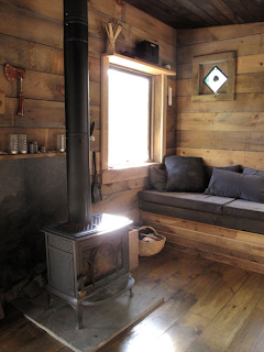
Why do some people feel that bigger is better? As I read the Susanka articles, I get the feeling that they think the only beauty in architectural interiors means having large, open spaces, with vaulted, or cathedral ceilings. Pump in some artificial lighting and decorate the walls with attached ornaments and the room will be like heaven on Earth. I am quite the opposite. My idea of cozy is simplistic. If you give me a small, two-room cabin, with windows to let in the sunlight, I am the happiest camper in the park.

The picture I chose is off the Internet (http://www.tinyhousetalk.com/wp-content/uploads/tiny-cabin-living-and-fireplace.png), but it loosely reminds me of a friend’s cabin near Rose City, MI. He has a three-room cabin that has minimal lighting (a 50’s style, round florescent in the “kitchen” area (this includes the dining area and wood burning, pot-belly stove) and a moth-stained 60-Watt light bulb in the “living” area (this includes two fold-away couches/beds and a recliner. The bedrooms are just large enough to hold bunks and have no lighting at all, just windows to let in the sun. Toss in a TV and hunting gear and you have his cabin…the coziest place on Earth. The picture is very simple, shows how natural lighting is provided and demonstrates how to provide and keep heat in a small, enclosed area. Smaller areas bring people closer together and tighter bonds result from that closeness. The furniture situation needs only to accommodate maximum capacity and creative thinking can have that furniture double as the bedding. Go ahead and keep your large, expansive rooms, with all of the unnatural lighting and appeal. For me, I prefer to stay out in the woods in a cabin that will bring its inhabitants closer together.

Sunday, February 13, 2011

Module 2 - Imaginative Bridges

I try not to use too much video in my classroom; it can be an addictive tool. I have seen some teachers that implement at least one or two videos per week and it becomes more of a babysitter, than a teaching tool. They show cartoons, or musical based videos that have nothing to do with an assignment and I find it wrong. I only get to see my students for one hour per week and I try to utilize as much of that time with personal contact as possible. This is not to say I do not believe in videos in the classroom, rather they should be used sparingly and should have direct impact on the lesson being presented. 

The Real Detroit Video & Commentary - Module 2


During this year’s Super Bowl, Chrysler presented an ad that showed a lot of Detroit’s finest points (http://www.youtube.com/watch?v=SKL254Y_jtc). The commercial was an instant hit with a lot of people, not just because it showed positive things, but it represented a city that is on the verge of resurrection. Detroit has long been associated with urban decay and corrupt government. The city has lost a million citizens and the businesses that were there to support it over the last 50 years, but it still presses on. I thought the commercial was very well written, narrated and presented. The filming of the commercial was very much “NYPD Blue,” with the camera wagging all over and having many little clips spliced together to form a single shot. The narration is all about how Detroit is its own entity and speaks loudly about the character of the city’s resilience. Detroit is best known for being the birthplace of the automobile assembly line and the production of cars since then. The music of the commercial starts off slow and subdued. It builds up through a continuous, choppy guitar 4-count strum to a choir on the Fox Theater stage crescendo. Musician, Eminem presents the pitch-point, “This is the Motor City and this is what we do,” just before a “Imported From Detroit” slogan appears on a white on black background over a Chrysler emblem.

Our assignment was to develop a “compelling” video, with a twist; try to stay away from the normal “Aww” and “Ooh” getters. As I struggled with this assignment I contemplated the absurd: a toilet paper commercial for related a body part (complete with music naming the location), but did not wish to offend my classmates, or professor. I also thought about the touchy-feely: a commercial that drums up support for your local fire department. I really had a hard time thinking of what I can do that is compelling, with a twist, without being gross, or sappy. It was not until late Friday night (10 February 2011) that the idea of twisting the Chrysler 200 ad hit me. BUT, when it did come to me, it was very clear how I wanted to shoot my portions and what items I wanted to include. The video I chose to shoot was contrary to Chrysler’s. We both intentionally set out to show a side of Detroit that needed to be displayed. Detroit has a lot to offer, but it also has a lot to avoid. I wanted my viewers to experience this through the imagery.

I called up a friend of mine and asked him to be my cameraman as I drove around Detroit, looking for items of opportunity. We strafed the neighborhoods, shooting targets of opportunity and used the Chrysler 200 commercial for a loose template on certain things (The Fist of Joe Louis, the flag pole left behind from Tiger Stadium at Michigan/Trumbull). The Chrysler Headquarters is up in Auburn Hills, but I had to drive past it on my way to Detroit, so it became fodder, plus, since I was making a parody of their commercial, fitting. We started filming at the Detroit Zoo and zigzagged our way through some of the neighborhoods looking for dilapidation and decay. It was not hard to find necessary footage. We were very happy when we came across a few dogs at a street corner. One of the dogs, as if on cue, started rummaging through a plastic bag on the ground, looking for food. We saw some graffiti that said, “Please Kill Me,” but we did not get a clear enough shot of it and I could not implement it into my video. Yhat would have fit very well into my version. As I was editing the footage we had just taken, I thought of closing out my parody with an M&M character as a twist on Chrysler using Eminem for their spokesman; just a weird sense of humor thrown in my video.

For my background music, I chose Black Sabbath’s, E5150, which is an intro to Mob Rules. The long, choppy guitar gave me ample time to narrate my question/story about Detroit. It took forever for me to play the song with Windows Media Player, record it with Audacity and convert it to a WAV file for usage. It was hard to get the music volume loud enough to be heard, without being competitive with the narration. After the background was established, I had to go back, switch around the footage pieces and make them fit the timing of the sound. It was quite the experience.

Friday, February 11, 2011

Video Project

I don't know about you, but this video project has me quite stumped. I have done tons of artistic flat work, but video? I have no clue what "compelling" theme to promote. 2 days left though...better get going.

Wednesday, February 9, 2011

Product Placement Productions Presents:

What kind of imaginative bridge can I talk about between film/television and an art class? Without art, there is no film or television. Art is the foundation between the two entities. It takes composition and lighting. It takes item placement and viewpoints. It takes colors and design too. You name it; art has had a hand in what we find appealing in today’s world. The question is: How much does art play a roll in the making of a movie, or TV show?

How many times have you watched a moving picture show and said, “I can do that!” Making quality film productions is not as easy as you might think. You have to think about the camera angle, the lighting, the composition, and the placement of every item within the shot. The facial features of the actors, or the contortions thereof, can lead to negative viewing. What would you do if your actor had a huge mole on their left cheek and had to film a love seen? You would shoot it so the camera only sees his right cheek. A case in point for product placement would be Budweiser’s Bud Light Super Bowl Commercial: http://www.youtube.com/watch?v=Trc9Nu_e6qE

Doritos Ad Review For FB


Just like a true kid….wait until the last minute to do something they have been asked to take care of.

I was sitting around the TV with 12 firemen when this commercial came on. We were judging all the commercials while waiting for the Super Bowl to come back on. It was like being at a teenage party and somebody says something dumb. The riotous laugh that came up when Grandpa’s ashes hit the floor was real loud. We knew what was going to happen before they even showed it. They did not need to literally show the reunion, but it was cool.

Now, coming from an artist’s viewpoint, I can find the humor very easy in this ad. The music is not overbearing; just a series of guitar strums accented with a continuous drop-snare beat, which was interrupted with the dropping of the ashes onto the floor.  30 seconds moves by real fast with all of the action that takes place, from the guy watching TV to all the clean up and resurrecting via the power of Doritos. The guy’s face looks painful as he is desperately sprinkling Doritos into the fish tank and confused when the fish comes back to life. He tries again with the dead plant and has that “Yeah, I’m Good” look when it works again. The last look we get of the bad house sitter is “Oh Crap, how is this going to work” as he hears the key enter the lock. But, how many people notice that the guy barely quits munching the Doritos, even as Mikey and Grandpa hug all over each other? Personally, I liked the Doritos ad that had the guy sucking the finger & sniffing the pants of his coworkers. This was disturbing, but funny at the same time.

Wednesday, February 2, 2011

Crossing Video Over To My Room

Working in the Lansing School District presents a lot of challenges; one of which is the lack of available technology. I teach in three different buildings and one has me doing "Art-on-a-cart." You try showing a video to 10 different classrooms when each teacher has different set-ups (if any at all).

I would love to be able to create a "documentary" about different art movements and the artists that worked in each. If I ever get the opportunity to use technology in my art class, the kids eat it up. The trick is to make the subject matter interesting, so that the students do not just phase out and ignore what the lesson. I did find and present a cartoon video biography about Leonardo da Vinci. I usually have "Tootsie Roll Quizzes" when I give art history, but I made this one real interesting. I placed $2 on my desk and challenged my 5th graders to get 100% on my test. One of the questions had obscure information, but I told them to listen very hard to one particular section. Needless to say, I kept my $2

For those that ask what a "Tootsie Roll Quiz" is - I present biographical information (movie, reading, lecture...) and the students get to take notes. I ask Who, What, Where, When, Why & How questions and the kids get to use them notes to answer the questions. As I administer the quiz, I walk around the room, repeating the information over and over, throwing Tootsie Rolls to the first child to answer my question correctly. I give the quiz again a week later, but without the notes and it is amazing how well the kids remember the information. Try it!

Video Information

Hi All!

Would it surprise you if I told you I hate to read? I do! I hate it with a passion. I used to be involved with "Speed Reading" a long time ago, but even that became boring. I would finish off a book in one day and I never spent time burning off energy (highly necessary for somebody with ADHD).

We are starting to work with video...yea!! We are narrowing this down by talking about documentaries and research video. To me, one of the best documentary videos has to be Ken Burns - Baseball, a nine "inning" saga that talks about the origins of the game and brings you up to modern day. As a baseball freak, this history on speed is just the thing that interests me.

Tuesday, January 25, 2011

Gettysburg, PA - 25 January 2011

Hi All,

I posted my photography assignment pics on Facebook, but will do the same here.

I went to Gettysburg, PA over the July 4th holiday last year and I took almost 300 pictures. I like to play around with my camera and sometimes I try to get a little serious with it too. As we were walking down main street, we came upon the train station. I ran across the street and quickly snapped a shot of my wife and daughters in front of the building. All I did for this was to center the building and zoom out just enough to catch one of my girls playing on the train tracks. I did not care about the background, or the composition, all I cared about was to capture the moment.

As I started to walk back across the street, I looked down the main drag and noticed how the depth of the town made for a nice composition. I quickly changed the settings on my camera to panoramic and took a series of three pictures. I panned from left to right, capturing the train station, main street and the restaurant. I used  the telephone pole and train crossing bars as a frame. It is not perfectly centered, but close enough to draw your eye in the direction of looking down the street. This way, you see what I saw on this day.

I posted both pictures in black/white and in color so you can see/compare for yourself how much the color adds to the scene. Gettysburg is a brightly painted city and I feel that the black/white pictures loses a lot of the feel for the town. The color photographs give you that, "I was there" feeling.


Sunday, January 23, 2011

CEP882 - Week 1 Close-Out

OK people....it is the end of our first week with all our new gadgets & correspondence tools & I am still just as lost as I was on day one of class. I keep getting into ANGEL to see if/when assignments are due & I try to keep them straight, but I have 3+ classes going on and keep losing my place.

I have this Blog, but not sure if my classmates are supposed to post comments here. I have talked to a few of you on FB Chat & it is fun to get to know some details of my classmates. What else are we supposed to be doing? Reading only takes me so far. Doing takes me places. I am ready to DO something. I guess this means I better go do the rest of my Photography Lesson :)

Tuesday, January 18, 2011

CEP882 - Week 1

This blog is supposed to be about "A-Ha" moments, but I usually don't get those; mine are more like "O-Chit!"

This week's "O-Chit" is complimentary to Michigan State University as in "What the hell did I get myself into?" I am trying to finish up a dual Masters run in two years and I am registered for 3 classes + 1 deferred portfolio this semester. I need to get out of school and start paying back my student loans....Satan wants his money back.

I was reading along with the assignments about photography and I kept saying that this is all stuff I taught myself as I grew up. I have always been able to draw, but it was not until I was told to get out of an art class (by a gym teacher of all people) that I took art seriously. Compositions, contrast, emphasis...these are all terms I have been using for 30 years now. I have used everything from a Polaroid Instant Camera (crappy pictures), to a manual 35mm (great shots, but expensive to operate) and have moved up to the digital age (Kodak EZ Share-12X Zoom). I like to take tons of pictures of things that interest me, but can only find a few worthy of being called artistic. I use paint.net (a free version of photoshop) to edit my pictures and I like to store my good stuff in electronic limbo, like in a Facebook Photo Album. This way, if ever in the event of an emergency, I will never lose my pictures; I would just have to reprint them.

Monday, January 17, 2011